People Power Party to Unveil New Name and Logo in March
Signals Intent to Refresh Image Ahead of Elections
From the Democratic Liberal Party to the People Power Party
A Brand Redesign Strategy Repeated at Every Crisis
The People Power Party is once again moving to change its nameplate, about 5 years and 5 months after it revised its party name in September 2020. It is reported that the party is reviewing an overall overhaul of its image, including its logo and symbolic color.
According to political circles, the People Power Party is pushing a plan to unveil a new party name as early as March 1, after going through a public contest and the party constitution amendment process. This appears to reflect an internal judgment that the party needs to refresh its image ahead of the June 3 local elections. Analysts say the move is largely aimed at breaking away from the entrenched image of an "old-fashioned conservative" that has hardened amid a series of political setbacks and election defeats, and at redefining its identity as an opposition party.
This is not the first time a conservative party has tried to renew itself by changing its name and logo. Since the three-party merger in 1990, the conservative bloc has repeatedly attempted fresh starts by changing its name and symbols at every major political crisis or turning point.
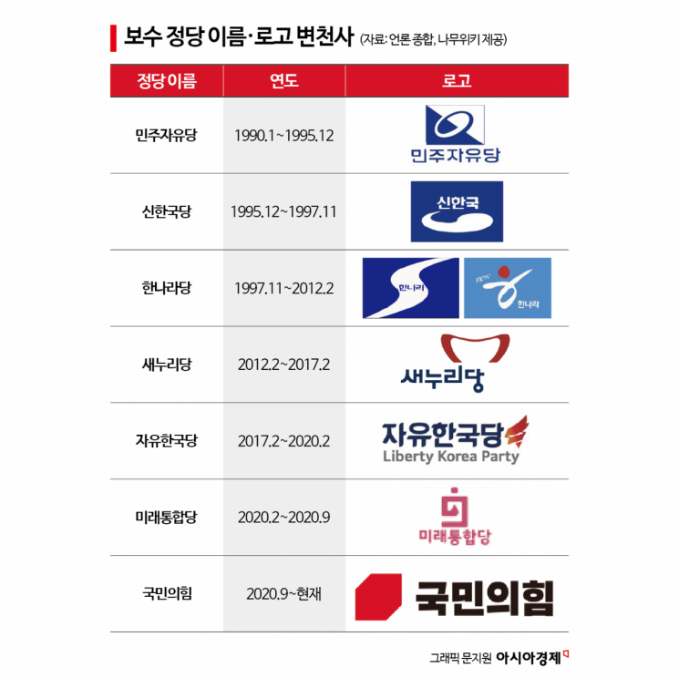
Democratic Liberal Party (1990.1~1995.12)
The starting point of modern conservative parties is generally regarded as the Democratic Liberal Party, which was launched in January 1990 through the "three-party merger." This was a large ruling party formed by the merger of the Democratic Justice Party (aligned with Chun Doohwan and Roh Taewoo), the Reunification Democratic Party (aligned with Kim Youngsam), and the New Democratic Republican Party (aligned with Kim Jongpil).
The Democratic Liberal Party is evaluated as a transitional conservative coalition party that bridged the shift from an authoritarian system to a post-democratization system. By incorporating both the words "democratic" and "liberal" in its name, it sought to emphasize both the democratization trend and the values of liberal democracy.
Its logo was a modified Taegeuk pattern on a blue background. This became the starting point for blue being used for a long time as the symbolic color of legitimacy in conservative parties.
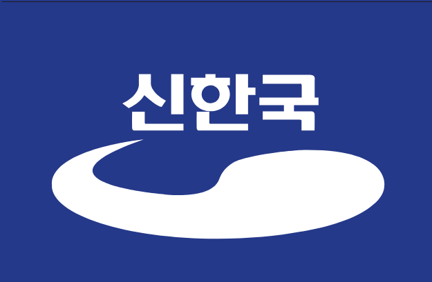
New Korea Party (1995.12~1997.11)
In December 1995, the Democratic Liberal Party changed its name to the New Korea Party. The new name reflected the Kim Youngsam administration's line of "civilian reform." Taken from the presidential campaign pledge of "Creating a New Korea," it embodied the will to shed the image of a military regime and transform into a modern conservative party.
The logo also retained blue, while expressing the Taegeuk pattern in a more dynamic curved form. It was a design that maintained continuity with traditional conservatism while emphasizing reform and a future-oriented outlook.
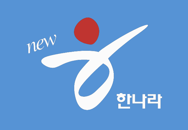
Grand National Party (1997.11~2012.2)
In November 1997, the New Korea Party and the United Democratic Party merged to form the Grand National Party. Born just before the IMF foreign exchange crisis, it went on to serve as the flagship party of the conservative bloc for nearly 15 years.
The Grand National Party lost the presidential elections in 1997 and 2002, but went on to win the 2006 local elections, the 2007 presidential election, and the 2008 general election, securing its position as the ruling party.
Its initial logo maintained a blue palette. When the party revamped its logo in 2004, it introduced a bright sky blue and adopted an "h"-shaped symbol using white and red to emphasize dynamism and change.
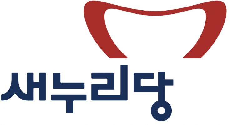
Saenuri Party (2012.2~2017.2)
In February 2012, the Grand National Party changed its name to the Saenuri Party. The decision aimed to overhaul its deteriorated image following setbacks such as the loss in the 2011 Seoul mayoral by-election. With the meaning of a "new world," it declared itself a future-oriented conservative party.
At this time, the conservative party completely changed its symbolic color from blue to red. Through a vivid red, it sought to highlight energy and change, as well as the image of economic democratization. Red subsequently became the representative color of the conservative bloc.
However, as the impeachment of former President Park Geunhye unfolded in 2016, support for the Saenuri Party plummeted, and the party once again moved to change its nameplate.
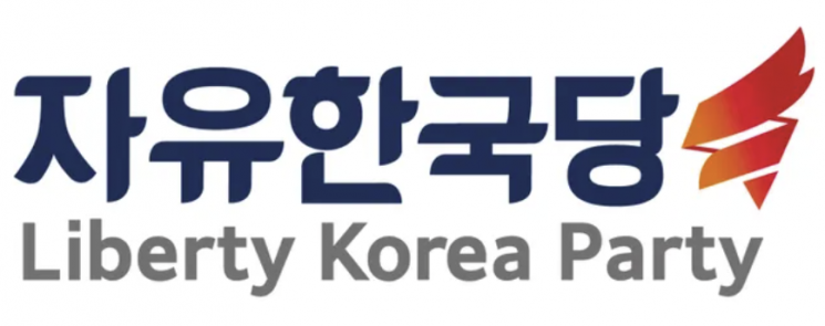
Liberty Korea Party (2017.2~2020.2)
In February 2017, the Saenuri Party changed its name to the Liberty Korea Party. By combining "liberty" and "Korea," it placed the values of liberal democracy at the forefront.
The logo retained red but adopted a torch motif to symbolize the "flame of liberty." Although it aimed to unite and rebuild the conservative bloc that had fractured after the impeachment, it went on to suffer consecutive defeats in the 2017 presidential election and the 2018 local elections.
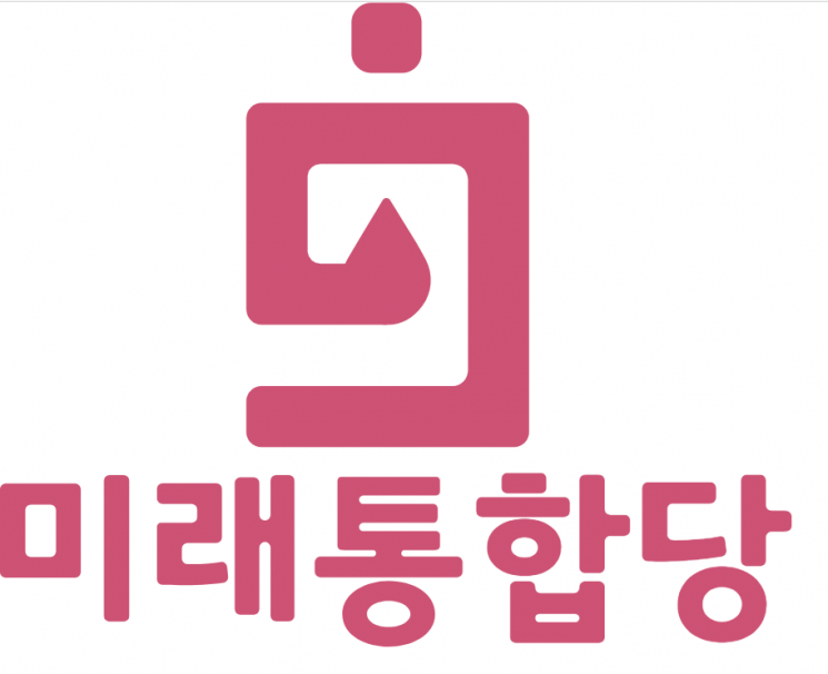
United Future Party (2020.2~2020.9)
In February 2020, the Liberty Korea Party merged with the New Conservative Party, the Advancement Party, and others to launch the United Future Party. The name symbolized the re-unification of the conservative camp.
For its symbolic color, it chose a light pink instead of the existing strong red. The party described this as a color symbolizing "unity," "future," and "cleanliness." The logo combined a shape representing the Republic of Korea with a DNA image to convey a message of hope and unity.
However, it suffered a crushing defeat in the 21st general election in April of the same year, and discussions on another party name change began.
People Power Party (2020.9~present)
On September 2, 2020, the United Future Party changed its name to the People Power Party. By putting "people" at the forefront rather than a specific ideology, it sought to broaden its appeal.
The logo currently in use is a simple design that combines a red square block with black lettering. It maintains the conservative bloc's red identity while emphasizing an intuitive and modern image.
The People Power Party is once again seeking changes to its name, logo, and symbolic color. This is interpreted as a political act aimed at redefining the direction and identity of the conservative bloc, going beyond a simple brand renewal.
Whether the new nameplate will actually lead to broader support, or remain just another symbolic change, is expected to be gauged by the results of upcoming elections.

© The Asia Business Daily(www.asiae.co.kr). All rights reserved.


