Connectwave, an e-commerce specialist, announced on December 18 that its integrated e-commerce solution, Makeshop, has launched a new responsive design skin to maximize the operational efficiency of online stores.
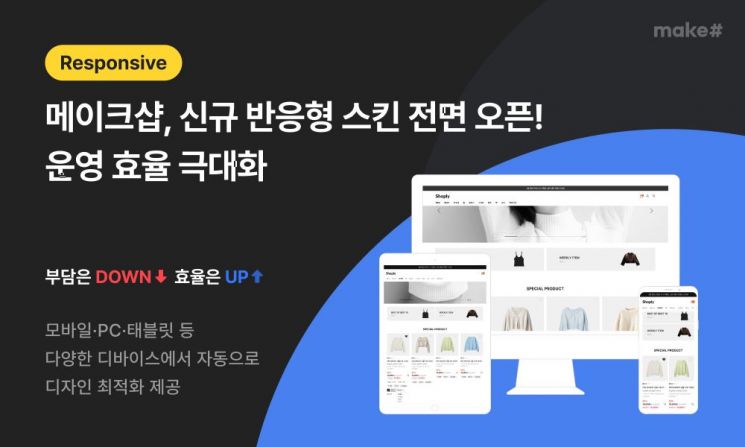
The newly released responsive skin automatically optimizes its design according to the device's screen size, providing a consistent look and functionality across various devices including mobile, PC, and tablet. This allows for efficient online store management without the need to separately modify the skin for each device.
Visitors to the online store can now enjoy an optimized shopping experience on any device. For operators, management efficiency is greatly improved compared to running separate mobile and PC versions, and the minimized UI/UX differences across devices enable a consistent brand experience.
There are also various technical advantages. By maintaining a single internet URL structure, search engine crawlers can easily recognize the site without duplicate content issues, which is beneficial for search engine optimization (SEO). The layout automatically adjusts to the viewport size, allowing new devices with different resolutions or aspect ratios to be supported without additional development. Page loading speed is also faster compared to previous methods.
With the launch of this responsive design skin, Makeshop aims to enhance convenience for online store operators, provide a better shopping experience for consumers, and further strengthen its position in the e-commerce market.
A Makeshop representative stated, "The responsive skin is the optimal solution for operators who need to minimize management elements of their online stores," adding, "In addition to the basic responsive skin, we will continue to update a variety of design skins to help strengthen the competitiveness of online stores."
© The Asia Business Daily(www.asiae.co.kr). All rights reserved.
![Clutching a Stolen Dior Bag, Saying "I Hate Being Poor but Real"... The Grotesque Con of a "Human Knockoff" [Slate]](https://cwcontent.asiae.co.kr/asiaresize/183/2026021902243444107_1771435474.jpg)


