With a Simple Design and Pastel Colors Reflecting "Rest and Comfort"
On July 10, Dongseo Food announced that it has applied a new package design to its Dongseo Tea product line. This renewal was planned based on the brand idea of "rest and comfort." To convey the sense of ease and solace that a cup of tea provides, the company adopted a simple design and pastel colors, and also improved the logo font to create a younger and more sophisticated image, capturing the brand's emotional essence.
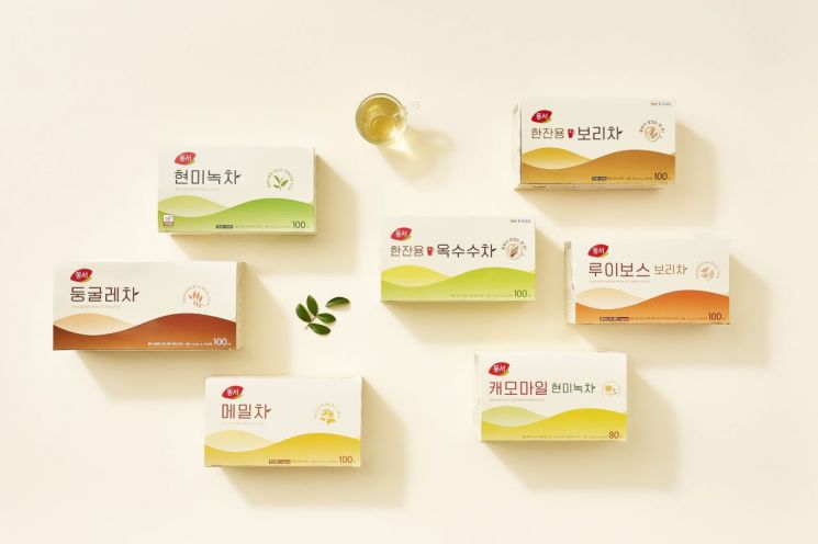
Various elements have also been incorporated to help consumers select and enjoy the products more easily. Each product features icons that intuitively indicate the recommended temperature and volume for hot or cold water, steeping time, and the main flavor characteristics of each tea.
Jung Daun, marketing manager at Dongseo Food, stated, "This renewal of Dongseo Tea is a delicate attempt to express the brand's emotional essence of 'rest and comfort' contained in a cup of tea," adding, "We plan to continue introducing products that offer small moments of relaxation in daily life while communicating with a diverse range of consumers."
The domestic tea market is estimated to be worth approximately 400 billion won. Recently, the market has continued to grow as more consumers enjoy tea as a beverage for emotional stability or mood enhancement, or conveniently choose single-serving teas as a substitute for water, and as a variety of new products are launched.
© The Asia Business Daily(www.asiae.co.kr). All rights reserved.
![Clutching a Stolen Dior Bag, Saying "I Hate Being Poor but Real"... The Grotesque Con of a "Human Knockoff" [Slate]](https://cwcontent.asiae.co.kr/asiaresize/183/2026021902243444107_1771435474.jpg)


