Introduction to the 4-Month Brand Development Process of Dongdaemun-gu Council at the Final Report Meeting
"We will strive to have the research service results officially adopted as the symbol of Dongdaemun-gu Council"
The Dongdaemun-gu Council is reported to have developed a symbol that can diversify the promotion of its legislative activities after listening to the opinions of 1,957 residents.
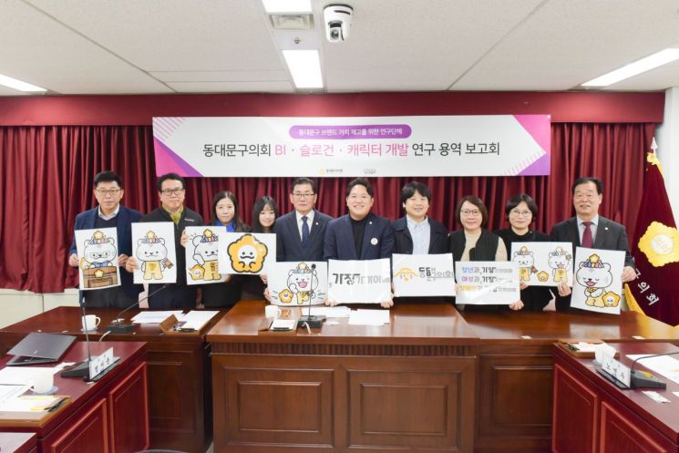
The 'Research Group for Enhancing the Brand Value of Dongdaemun-gu' of the Dongdaemun-gu Council, Seoul Metropolitan City, announced that it held the final report meeting for the ‘Dongdaemun-gu Council Character, Brand Identity (BI), and Slogan Development Research Project’ on November 25 in the Welfare and Construction Committee Room.
At the meeting, Representative Kim Se-jong, Secretary Jung Seo-yoon, Chair of the Administrative Planning Committee Noh Yeon-woo, Councilor Seo Jeong-in, Chair Lee Tae-in, Chair of the Operations Committee Choi Young-sook, Chair of the Welfare and Construction Committee Ahn Tae-min, along with Kim Il-ha, Chief Researcher of Kogle Planet?the contractor company?researcher Moon Gyu-ri, and Dongdaemun-gu Council’s Director Kim Chun-young and the Public Relations team attended.
The final report meeting introduced and evaluated the four-month research and development process of the Dongdaemun-gu Council symbol. The agenda included ▲project overview ▲survey extracting 355 keywords ▲character & BI draft production process ▲design preference survey of 1,602 residents ▲274 entries from the slogan contest ▲expert consultation ▲design development ▲and introduction of the final design.
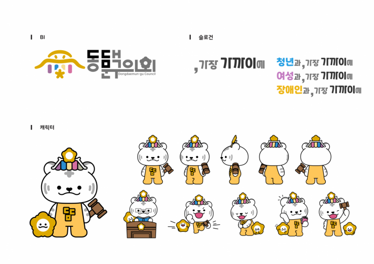
The character and BI were finalized by revising and supplementing the draft that ranked first in the ‘resident preference survey’ conducted at the 2024 Dongdaemun Festival. The character, tentatively named Ddolmangi, was inspired by the legendary white tiger Baekho, and to give a traditional image, it wears a tiled roof hat. To promote a clean Dongdaemun-gu, another character named Cheongnyeom-i, shaped like the council’s emblem, was also created. The BI simplified the council’s roof and actively utilized the council emblem, emphasizing the consonants ‘ㄷㄷㅁ’ of Dongdaemun.
The slogan ‘Closest to You’ was selected from 274 entries submitted through a public contest. Experts praised the slogan for its practicality and scalability, as it can be used with any preceding subject, expressing the intention to reach out to all residents.
The chairpersons and standing committee chairs said, “We believe that completing the Dongdaemun-gu Council character, BI, and slogan with limited budget is itself a success,” and added, “We will work together to have these officially adopted as symbols of the Dongdaemun-gu Council.”
The research group members emphasized, “Through a blind review conducted by the ‘Research Contractor Selection Committee’ formed independently by the research group, we selected the most capable company among seven participants, which led to this successful outcome. Although the process of selecting and revising the design was challenging, we are satisfied with the symbol, feeling that all the time and effort were worthwhile. In particular, we avoided colors associated with political parties and reflected opinions from people of all ages and genders to ensure the symbol can be established as the brand of Dongdaemun-gu Council for a long time.”
© The Asia Business Daily(www.asiae.co.kr). All rights reserved.
![Clutching a Stolen Dior Bag, Saying "I Hate Being Poor but Real"... The Grotesque Con of a "Human Knockoff" [Slate]](https://cwcontent.asiae.co.kr/asiaresize/183/2026021902243444107_1771435474.jpg)


