Change to a Concise and Flat Shape
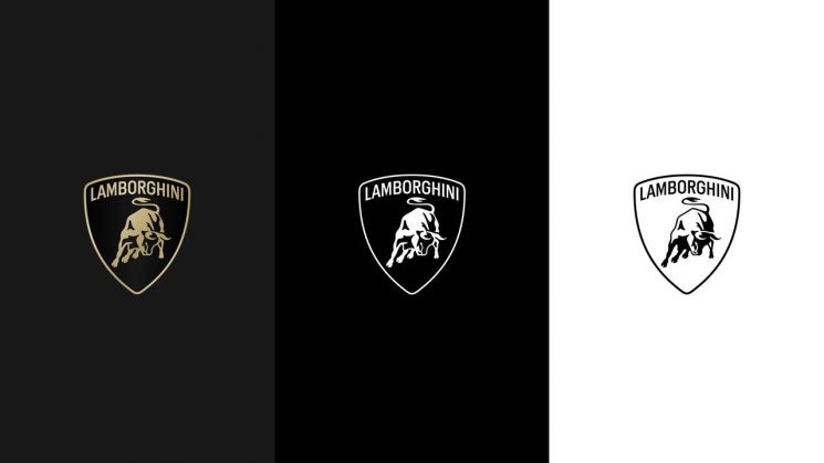
Lamborghini has changed its brand logo for the first time in over 20 years.
Automobili Lamborghini announced on the 4th that it changed the logo to better reflect its core values.
This logo change embodies a strategic shift aligned with Lamborghini's new phase of electrification strategy, "Direzione Cor Tauri (Towards the Heart of the Bull)."
First, the business card was removed, and the central bull and shield shape were redesigned with a flat design and clear lines. The font was also changed, and the logo is now styled in black and white.
The new logo will be applied to all Lamborghini vehicles released in the future. Additionally, the central bull will be separated from the shield emblem and used individually. For the first time, a new icon set developed in collaboration with Lamborghini's motorsport division, "Centro Stile," will be used collectively.
An Automobili Lamborghini representative explained, "In a rapidly changing environment, we will move forward toward the future with a new logo that embodies innovation and decisiveness."
© The Asia Business Daily(www.asiae.co.kr). All rights reserved.


