From 3D Stereoscopic Design to 2D Flat Design... Adapting to the Digital Era
[Asia Economy Reporter Kim Ji-hee] Global automakers are successively replacing their emblems. The new emblems boldly exclude three-dimensional effects and texture expressions, featuring flat and simple images.
According to the industry on the 5th, BMW, Volkswagen, and Nissan recently changed their brand emblems that had been used for decades. Most of these companies replaced their existing 3D emblem designs with 2D flat designs suitable for the digital era.
First, BMW Group unveiled the 6th generation emblem design in March. It is a new logo introduced 23 years after the current design was adopted in 1997. The blue and white quartered design inside the circle remains unchanged, but the existing black border was removed and made transparent. A 2D format was also introduced to convey openness and clarity, embodying a futuristic image. Although it has not been decided whether the new design will be applied to mass-produced vehicles, it is meaningful as it reflects the direction BMW Group aims for in the future.
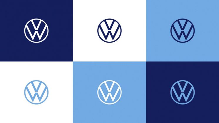
On the 22nd of last month, Volkswagen joined the emblem replacement trend. The new logo, first revealed at the '2019 Frankfurt Motor Show' last September, was introduced domestically as well. Volkswagen explained that they aimed to express the brand value focused on essence clearly and simply. In particular, the emblem can be flexibly used across various digital environments, emphasizing a modern and dynamic image. With this emblem change, Volkswagen officially marked a new start toward the ‘New Volkswagen.’

Japanese automaker Nissan also introduced a new brand logo composed of typography and simple lines in March. When the logo was first previewed at the 2019 Tokyo Motor Show, Nissan was reserved about whether it would be adopted in the future, but has since begun the replacement process in earnest.
Among domestic car brands, Hyundai Kia Motors has either replaced or is preparing to replace their emblems. Hyundai’s premium brand Genesis recently changed its emblem to a flat and simplified form. Kia is actively preparing to replace its emblem in the second half of this year. It is expected that the new emblem will be a 2D form similar to the logo applied to the electric concept car ‘Imagine by Kia,’ which debuted at last year’s Seoul Motor Show.
The reason automakers are adopting simple 2D emblem designs is analyzed to be their intention to respond to digitalization and electrification. Logos simplified into surfaces and lines are also attractive because they can be more flexibly used on digital platforms. An industry official said, “Efforts by automakers to complete emblem designs that can blend into vehicles in line with the trends of vehicle digitalization and electrification will continue.”
© The Asia Business Daily(www.asiae.co.kr). All rights reserved.
![Clutching a Stolen Dior Bag, Saying "I Hate Being Poor but Real"... The Grotesque Con of a "Human Knockoff" [Slate]](https://cwcontent.asiae.co.kr/asiaresize/183/2026021902243444107_1771435474.jpg)


