[Asia Economy Reporter Yujin Cho] Amorepacific Group has been honored with a triple crown at the German international design competition 'iF Design Award 2020' with its brands Blank, O'Sulloc, and Innisfree.
The iF Design Award is a global design competition considered one of the world's top three design awards alongside Germany's 'Red Dot' and the United States' 'IDEA.' It annually recognizes excellence across seven categories?product, packaging, communication, concept, service design, interior, and architecture?evaluating design, innovation, and functionality comprehensively.
Blank, which won in the communication category, is a makeup specialty brand newly launched in 2019. Instead of heavy coverage makeup, it pursues makeup that confidently highlights one's strengths and expresses personal tastes and individuality.
Reflecting the brand's identity, unnecessary elements excluding natural beauty were boldly removed, and it received high praise for communicating with customers through a sophisticated yet restrained design combined with striking visual presentation.
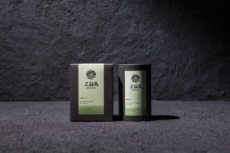
O'Sulloc and Innisfree each received awards in the packaging category. O'Sulloc was recognized for the design of its Pure Tea line, which was renewed and relaunched in July 2019 with a completely redeveloped product packaging design. The Pure Tea line, embodying the essence of O'Sulloc, is a flagship product that demonstrates the brand's reliability and authenticity.
In packaging, to fully convey the brand, the Jeju O'Sulloc green tea field pattern design was refined and applied as a subtle embossing, serving as a symbol representing both the brand and the tea.
The front of the packaging expresses the color extracted from tea leaves, allowing intuitive recognition of the fermentation level, and includes a concise description of the tea.
Innisfree won with its flagship men's line, 'Forest for Men.' This line is designed by adding the sensibility of millennial men to the naturalistic brand authenticity that contains ingredients from Jeju's pristine nature.
The product container design is inspired by stones worn down over a long time by the Jeju sea, expressing the strong vitality of Jeju Gotjawal moss, a key ingredient, through a mysterious blue hue and the deep color of Jeju basalt.
Heo Jeong-won, head of the Amorepacific Design Center, said, "We are pleased that the designs reflecting each brand's identity and product characteristics through the sensibility of Amorepacific Group designers have been highly recognized worldwide," adding, "We plan to continue various considerations and challenges to ensure that creative and beautiful designs firmly build brand images."
© The Asia Business Daily(www.asiae.co.kr). All rights reserved.
![Clutching a Stolen Dior Bag, Saying "I Hate Being Poor but Real"... The Grotesque Con of a "Human Knockoff" [Slate]](https://cwcontent.asiae.co.kr/asiaresize/183/2026021902243444107_1771435474.jpg)


