Chongkundang Miraeche Typeface Applied
Emphasizing Chongkundang's Symbol and the Mission of a Pharmaceutical Company
Chongkundang, celebrating its 84th anniversary this year, has unveiled a new Corporate Identity (CI) for the first time in over 50 years. This renewal reflects the company's determination to become a global pharmaceutical enterprise.
On May 7, at Chongkundang’s headquarters in Chungjeong-ro, Seodaemun-gu, Seoul, Chairman Lee Janghan and company executives and employees announced the newly revamped CI during the 84th anniversary ceremony.
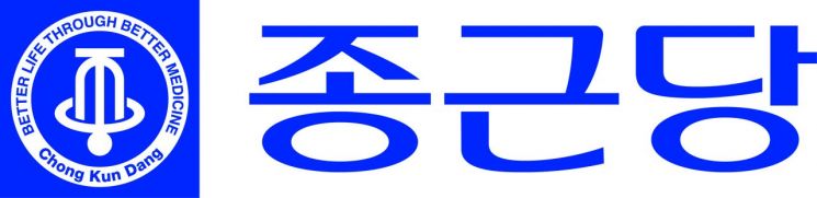
The new CI introduces changes to the symbol, font, and colors compared to the previous version, emphasizing a global-oriented image. The English CI, which will be widely used in global markets, abbreviates Chongkundang’s English name, "ChongKunDang," to "CKD."
In the 1950s, Chongkundang introduced its first symbol mark by placing a cross (+), representing sacrifice, service, and health, inside a hexagon symbolizing compounds. This expressed the company’s commitment to improving public health through pharmaceuticals in the challenging post-war environment.
The use of a bell as the company’s symbol began with a design contest in 1960. The winning entry, created by a Seoul National University art student, was inspired by the sound of church bells at dawn. It combined the Korean character for "bell" (Jong) with a cross-section of a bell, using simple lines to visually represent sound.
At a time when the company completed the nation’s first active pharmaceutical ingredient synthesis plant and began producing medicines domestically, the symbol embodied the enduring philosophy of respect for life. In the late 1960s, a circle representing respect for humanity and the perfection of the universe was added, expressing the company’s belief in producing medicines of perfect quality as it pioneered pharmaceutical exports from Korea.
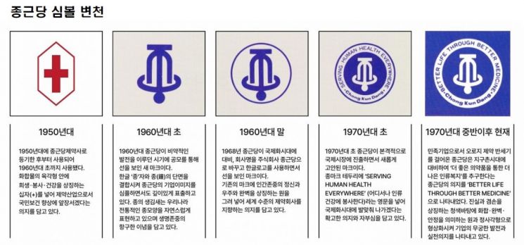
In the early 1970s, the phrase "SERVING HUMAN HEALTH EVERYWHERE" was added to the circular border surrounding the symbol, demonstrating a firm commitment to globalization as the company began exporting pharmaceuticals. In the mid-1970s, the slogan was changed to "BETTER LIFE THROUGH BETTER MEDICINE." With the opening of the Central Research Institute, this reflected the company’s dedication to developing high-quality medicines. The combination of a circle and a square, symbolizing harmony, perfection, and stability, expressed the company’s ambition for endless growth and commitment to action. The CI also incorporated the "Jongkundang" logotype created in Iljungche script by renowned Korean calligrapher Kim Chunghyun, and this combination has been used as Chongkundang’s CI to this day.
In the newly updated CI, the symbol retains its original form, but the size of the bell has been increased to highlight Chongkundang’s emblem. The diameter of the surrounding circle has been expanded, and the font size of the slogan inside the border has been enlarged to emphasize the company’s mission for human health.
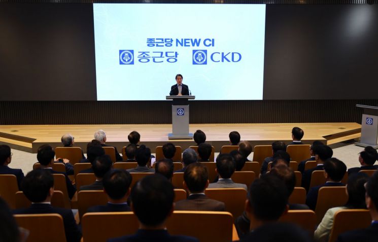 On the 7th, at the Chongkundang headquarters in Seodaemun-gu, Seoul, Lee Janghan, chairman of Chongkundang, announced the new CI at the 84th anniversary ceremony.
The typeface now uses "Chongkundang Miraeche," a proprietary font developed by the company. Chongkundang Miraeche blends the characteristics of Dotum and Gulim fonts to create a style that is both soft and strong, expressing the company’s enterprising spirit for the digital era. The upward-slanting strokes of the font represent Chongkundang’s dynamic growth and global expansion in a modern and refined way. The initial consonant "ㅈ" of "Jong" is designed to symbolize employees uniting and energetically leaping toward the future. Notably, the square frame previously surrounding the logotype has been removed and the letter size increased for greater clarity and readability.
The logo color maintains Chongkundang’s signature blue (CMYK: C100+M68+Y0+K12), which symbolizes birth, life, and hope, while increasing brightness (C100+M85+Y0+K0) to enhance the company’s image of a bright future and environmental friendliness.
Chairman Lee Janghan stated, "With the new CI, we will advance as a global pharmaceutical company and realize Chongkundang’s future vision of 'Creative K-healthcare DNA (CKD),' fulfilling our mission as a pharmaceutical company to contribute to healthy lives for all?from individuals to all humanity, from prevention to treatment?through pharmaceutical technology innovation."
Chongkundang is applying the new CI to all materials and formats of the company and its affiliates. Outdoor signage at the Chungjeong-ro headquarters, as well as at offices, branches, factories nationwide, and overseas subsidiaries, has been replaced. Employee business cards, ID badges, all internal and external facilities, and product packaging have also been updated with the new CI.
© The Asia Business Daily(www.asiae.co.kr). All rights reserved.


