Teaser Video for Renewal Released on Social Media
Cass Logo Typeface Remains Unchanged
OB Beer announced on the 24th that it will revamp the brand identity (BI) of its flagship brand, Cass.
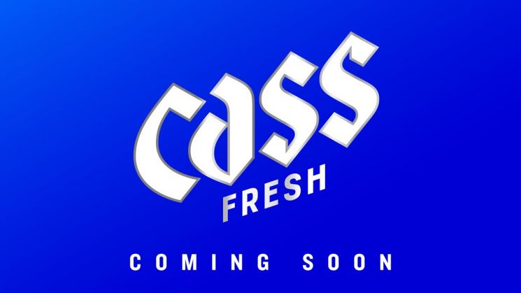
On the same day, Cass released a teaser video on its official social media channels, previewing the BI renewal. The core of this renewal is inspired by the fresh cascading waterfall, embodying Cass's spirit of continuous innovation and pursuit of change. The newly unveiled logo retains the original font that symbolizes high mountains and valleys from the initial design, while being reborn with a more sophisticated look. In particular, the 'Fresh' font at the bottom of the logo has been changed from a cursive style to a clean and simple style, allowing the brand to be perceived more intuitively.
Along with this, Cass plans to sequentially release videos introducing packaging featuring the new design. This renewal will be applied to all Cass products and advertising videos in the second quarter.
The Cass brand manager said, "For the past 30 years, Cass has continuously innovated like a flowing waterfall. This renewal is a strategic change to maintain ongoing innovation as the industry’s number one brand and to further solidify market leadership. Through this change, Cass plans to provide consumers with a fresher and more differentiated brand experience."
© The Asia Business Daily(www.asiae.co.kr). All rights reserved.


