Jinro 'Heritage' Application Strengthens Unique Image
HiteJinro announced on the 11th that it will revamp the label design of 'Jinro' soju to more clearly highlight its heritage.
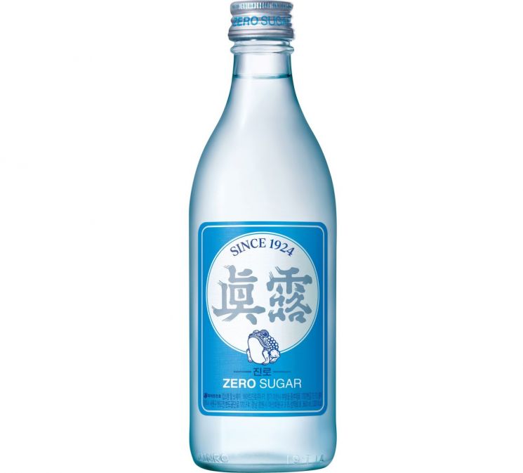
HiteJinro plans to maintain Jinro's signature sky blue bottle and overall blue-toned label while emphasizing the logo and toad symbol to capture consumers' attention. The position of the toad character has been changed from top to bottom to make it visually more prominent, and to emphasize Jinro's identity, the Chinese characters ‘眞露’ and the logo have been enlarged to maximize visibility. The product’s main ingredients, alcohol content, and price remain the same. The revamped product will be sold from the 14th at general restaurants, pubs, large supermarkets, and other entertainment and home channels.
Since its launch in 2019, Jinro has surpassed 2 billion bottles in cumulative sales over five years as of September, growing alongside Chamisul as a representative soju brand. The company evaluates the active marketing activities, such as the toad character and cross-industry collaborations, as key factors behind its growth. In particular, this year, to commemorate its 100th anniversary, it introduced the ‘Jinro KITH Edition’ in May and July, a collaboration with the global fashion brand ‘KITH,’ and the ‘Jinro Origin Edition,’ which applies the first label design used 100 years ago.
Oh Seong-taek, Executive Director of Marketing at HiteJinro, stated, “HiteJinro will continue marketing activities that inherit the original heritage of soju while resonating with the MZ generation to maintain and strengthen Jinro’s trendiness. As Korea’s leading comprehensive liquor company, we will lead liquor trends in line with the times.”
© The Asia Business Daily(www.asiae.co.kr). All rights reserved.
![Clutching a Stolen Dior Bag, Saying "I Hate Being Poor but Real"... The Grotesque Con of a "Human Knockoff" [Slate]](https://cwcontent.asiae.co.kr/asiaresize/183/2026021902243444107_1771435474.jpg)


