Seoul City Unveils New Design Proposal
The design of Seoul's subway map will change for the first time in 40 years. Routes will be marked with clearly distinguishable colors considering geographical information, and transfer stations will be indicated with traffic light-shaped symbols to show the path according to the line passengers intend to board. Major geographical information such as airports, the sea, and rivers will also be included for tourists.
Seoul City unveiled the new "Seoul Subway Map Design" on the 13th, created with advice from experts in visual, color, design, cognition, and transportation fields.

The Seoul subway lines have continuously increased from 4 lines (106 stations) in the 1980s to 9 lines (338 stations) in the 2000s, and currently 23 lines (624 stations).
By 2025, a total of 10 new lines including the Sillim Line, Dongbuk Line, Myeonmok Line, Seobu Line, Ui-Sinseol Extension Line, Mokdong Line, Nangok Line, Wirye-Sinsa Line, Wirye Line, and the 4th phase extension of Line 9, as well as the metropolitan area high-speed railroad (GTX), are planned to be established.
The newly created map applies the international standard 8-line type (Octoliner) to make it easy to recognize the many lines and transfer stations. Along with the 8-line type, the circular form of the Line 2 loop line is placed at the center, and routes considering geographical information are applied to improve readability and efficient navigation for users.
Transfer stations, which were previously mixed with regular stations using the Taegeuk pattern, have been changed to a traffic light-style notation. The colors of the transfer lines are listed and connected in a chain form so that users can easily follow their destination.
Additionally, to help tourists understand their current location directionally, boundaries between downtown and outskirts, Incheon Airport, the sea, rivers, and other major geographical information are represented on the map. Next year, landmark icons will be applied to the map to promote Seoul’s attractions. It is also characterized by the application of colors and patterns that are easy to see for colorblind, visually impaired, and elderly people.
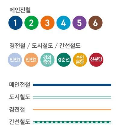
Lines (main subway, light rail, urban railway, trunk railway) are classified by route and importance according to color and type, and the expression of lines is subdivided by brightness and clarity focusing on Lines 1 to 9.
Regarding the improved design, the city conducted eye-tracking experiments targeting domestic and foreign people in their 20s and 30s. As a result, the time taken to find stations was reduced by up to about 55%, and the time to find transfer routes was reduced by up to about 69%. In particular, the reduction in time for foreigners was 21.5% higher than that for domestic users.
The improved map will be officially unveiled along with subway map-related goods at a public hearing held at 2 p.m. on the 18th in the multipurpose hall on the 8th floor of Seoul City Hall.
The final design is scheduled to be announced at the end of this year after collecting opinions from citizens and experts in various fields.
Choi In-gyu, Seoul City’s Design Policy Officer, said, "The new map is an easy-to-read design that considers visually impaired people and foreigners, contributing to more comfortable subway use," and added, "We plan to brand the map and utilize it in various promotions and connections."
© The Asia Business Daily(www.asiae.co.kr). All rights reserved.
![Clutching a Stolen Dior Bag, Saying "I Hate Being Poor but Real"... The Grotesque Con of a "Human Knockoff" [Slate]](https://cwcontent.asiae.co.kr/asiaresize/183/2026021902243444107_1771435474.jpg)


