‘I♥NY’ Rebranded After 46 Years... Emphasizing Citizen Participation
"Clumsy, Playful Heart and Strange Proportions" Criticized
New York City Explains "Not a Complete Replacement... Just a Supplement"
Criticism continues over the rebranding of the slogan of the global city New York, USA, from ‘I♥NY’ to ‘WE♥NYC’ after 46 years.
Recently, New York City unveiled a newly designed logo ‘WE♥NYC,’ replacing the iconic ‘I♥NY’ slogan that graphic designer Milton Glaser created in 1977 and which has served as a symbol of New York for over 40 years.
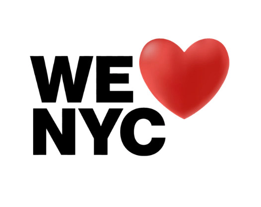 The 'WE♥NYC' logo introduced by New York City. [Photo source: Screenshot from the official WE♥NYC website]
Through this rebranding, New York City changed ‘I’ to ‘WE’ to emphasize citizen participation, and changed ‘NY’ to ‘NYC’ to focus on participatory campaigns taking place within New York City.
The campaign includes participation programs such as caring for parks by New York residents, cleaning communities across the city’s five boroughs, publicly voting for street musicians, and selecting the best menu items from New York City restaurants and catering companies.
New York Governor Kathy Hochul emphasized on the 20th (local time) when announcing the new logo, “The WE♥NYC campaign will preserve New York’s energy and spirit by encouraging New Yorkers from diverse backgrounds to participate together and bring positive change to their communities.”
New York City Mayor Eric Adams expressed pride, saying, “There are two types of people on this planet: those who live in New York and those who wish to.” He added, “I am proud to announce the launch of ‘WE♥NYC.’ This campaign will spread love to every block in all five boroughs with the help of everyone who loves the greatest city in the world.”
New Yorkers: "Worst Design Ever" vs New York City: "Not a Replacement, but a Complement"
 New York Mayor Eric Adams announcing the 'WE♥NYC' logo on the 20th.
 [Photo by Eric Adams, New York Mayor, Twitter capture]
However, local media such as The New York Times (NYT) pointed out that the ‘WE♥NYC’ logo has received much criticism from citizens and experts.
According to these media outlets, New Yorkers posted sharp criticisms on social networking services (SNS) such as “literally the worst design I have ever seen,” “unforgivably bad in many ways,” and “an insult to this great city.”
John Biller, president of the travel agency Altitude Luxury Experiences, criticized the new logo as “a solution no one asked for,” questioning, “Why modify a globally recognizable brand?” Cindy Augustin, a New Yorker and writer, pointed out that the new logo “looks like a rushed design caught between an ugly, playful heart and strange proportions.”
New York City explained that the ‘WE♥NYC’ logo does not replace ‘I♥NY’ but complements it. They also stated that the campaign aims to block the ‘division’ and ‘negativity’ triggered by the COVID-19 pandemic.
Graham Clifford, who created the new logo, explained, “I wanted to change ‘I’ to ‘we’ because I believe now is the time for us, not me.”
© The Asia Business Daily(www.asiae.co.kr). All rights reserved.


