1993 Launch Hite's Heritage, Modernly Reinterpreted
Changed to Newtro Concept Design Targeting New Consumers
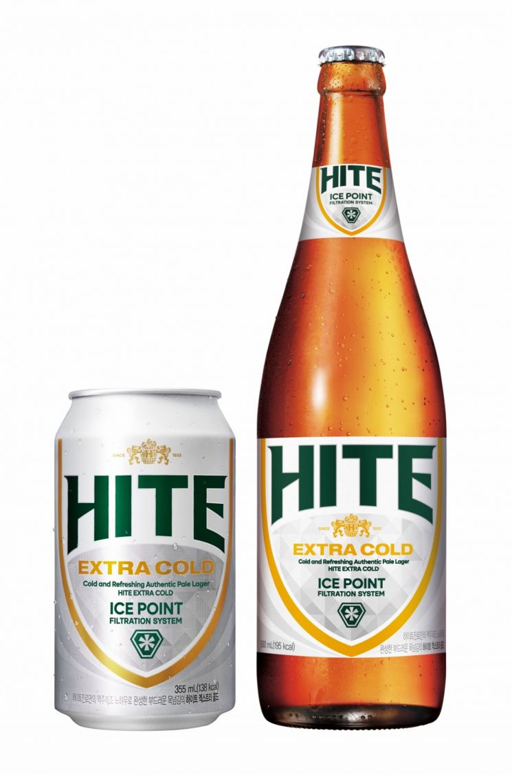
HiteJinro is revamping the package design of Hite beer, which is celebrating its 32nd year since launch.
On the 12th, HiteJinro announced that it will renew the design of all Hite products, including bottles, cans, and PET bottles, to expand new consumer inflow for Hite, which has surpassed cumulative sales of 35 billion bottles (based on 500mL) since its launch in 1993.
This renewal features a newtro design that modernizes the heritage from the 1990s launch, significantly increasing attention. The plan is to emphasize Hite’s authenticity and incorporate the atmosphere of the past to captivate consumers’ eyes.
The new design applies Hite’s classic shield-shaped label to add a luxurious image. The brand name has been changed from lowercase to uppercase letters, and the font, color, and size have been altered to make the logo stand out more prominently. Additionally, the ice point symbol was changed to visualize the refreshing taste of the beer, enhanced by the application of the Extra Cold brewing method.
Through the package renewal of Hite, HiteJinro’s strategy is to evoke nostalgia among past consumers and approach new consumers in a more familiar and close manner. The renewed products began production on the 11th and are scheduled for full distribution starting from the third week of September.
Oh Seong-taek, Executive Director of Marketing at HiteJinro, said, “We undertook the package renewal with a newtro concept to show consumers Hite’s unique heritage,” adding, “As the pride of Korean beer, Hite will continue differentiated activities to be loved by new consumers as well.”
© The Asia Business Daily(www.asiae.co.kr). All rights reserved.
