KBS Logo Controversy This Time... Japanese vs English Debate
KBS States "English Letter Combination Used Since 2019... Unrelated to Japanese"
KBS has been embroiled in controversy after airing a scene of Japan's national anthem 'Kimigayo' on Liberation Day and inserting a left-right reversed Taegukgi graphic in the news on the same day. Now, it is caught up in a 'logo controversy.'
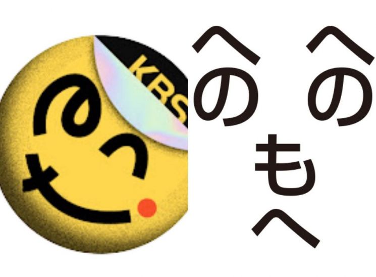
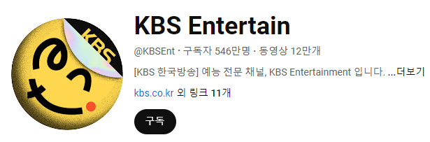
On the 15th, a post titled 'KBS YouTube channel logo: English vs. Japanese' was uploaded mainly on various online communities. The post claimed that the letters in the 'KBS Entertain' YouTube channel logo look like Japanese hiragana characters. 'KBS Entertain' is KBS's official channel with 5.46 million subscribers.
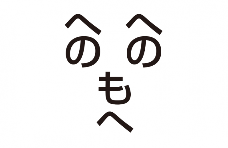
The author wrote, "Without thinking about the meaning, please answer whether it looks like English (e, n, t) or Japanese (の, つ/へ, ナ/メ) at first glance." They added, "For reference, using の as an eye is a characteristic of Japanese emoticons called Henohenomoheji."
In fact, in Japan, there is a wordplay called 'Henohenomoheji.' It is a game where Japanese hiragana characters are arranged to form a face-like shape as shown above. Henohenomoheji is said to be educational, aimed at infants and preschool children learning characters. It has appeared in famous animations like Crayon Shin-chan and is known domestically as well.
Most netizens in the post claimed it looks like 'hiragana.' They responded, "Even when riding the KTX, it looks like hiragana," "How can this look like English?" "Did they really do that openly? Are they crazy?" "I've often seen this in Japanese anime. It's 100% hiragana," "Even without prejudice, it looks like Japanese," and "I don't know hiragana, but it still looks like hiragana."
Some argued, "Isn't this too forced because of the controversy?" and "It does look like 'ent' though." In fact, KBS Entertain has been using the logo since 2019, before this controversy. A representative said, "The logo was already combining the widely used ENT English letters five years ago," adding, "It is unrelated to the current controversy."
Meanwhile, KBS previously apologized for the controversial airing of 'Kimigayo' and the 'left-right reversed Taegukgi.' KBS stated, "It was originally scheduled to air at the end of July but was postponed to the early morning of Liberation Day due to Olympic coverage," and apologized, saying, "The production team failed to check and review whether the broadcast content was problematic or timely considering the changed schedule."
Regarding the 'left-right reversed' Taegukgi, KBS explained, "It was the result of the producer flipping the Taegukgi image using computer graphics to match the scene where a person is holding the flag." They added, "We corrected the Taegukgi image immediately after identifying the issue. We are also providing the corrected video again on the news homepage. We sincerely apologize for this mistake and will pay close attention to even the smallest details to prevent such issues from recurring."
© The Asia Business Daily(www.asiae.co.kr). All rights reserved.
![User Who Sold Erroneously Deposited Bitcoins to Repay Debt and Fund Entertainment... What Did the Supreme Court Decide in 2021? [Legal Issue Check]](https://cwcontent.asiae.co.kr/asiaresize/183/2026020910431234020_1770601391.png)


