Sandoll, No.1 Font Company in Korea
Font Supplier to MS, Apple, Google, IBM, etc.
Developed Over 720 Fonts in 38 Years
Provides 24,000+ Fonts in 12 Languages via Platform 'SandollGureum'
To Be Listed on KOSDAQ Next Month
[Asia Economy Reporter Donghyun Choi] Whether in paper newspapers, news on smartphones, videos on TV or YouTube, or signs and restaurant menus encountered on the street, there is something we often come across but hardly recognize. That is the 'font.' Unless it is handwritten, letters in the digital age cannot exist without breaking out of the frame of a font designed by someone. The article you are reading now is no exception.
Nevertheless, not many people regard fonts as important creative works. This is because fonts are perceived as something essential like water and air, easily accessible anytime and anywhere. Asia Economy met with Sandoll, the number one font manufacturer in Korea, to look into the process of font creation. Font production is not simply about drawing and combining a few consonants and vowels; it is a task of embedding value and story through continuous dialogue between the client and the creator.
The Most Important Thing in Fonts is 'Communication'
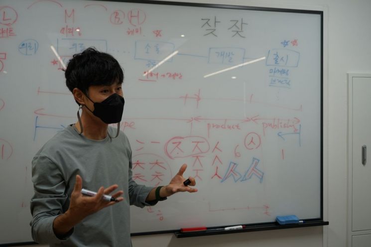 Shim Woo-jin, head of Sandoll Research Institute, is explaining the font creation process in an interview with Asia Economy.
"What kind of value do you want to embed in the letters?" This was the first question posed by Woojin Shim, head of the Sandoll Research Institute, just before starting font production at Sandoll’s headquarters in Seongsu-dong, Seongdong-gu, Seoul. Since the focus had been only on how to stylishly express the strokes of consonants and vowels, a concept that runs through the entire font did not come to mind easily.
Shim emphasized, "Fonts are created through five processes: request, intention, communication, development, and release," and added, "Among these, communication is the most important." Communication starts with confirming what identity the font client wants to assign to the letters and what problems they want to solve through the font. From this point, the company's unique story is embedded in the font.
If the client's purpose for font creation is unclear, communication takes a lot of time. Shim said, "It is easier to communicate with companies that come with a deep sense of urgency that fonts must be made," and added, "On the other hand, if the purpose is vague and they simply want a pretty style, then through lengthy communication, the production intent must be clarified more precisely."
ㅅ→ㅈ→ㅊ→ㅎ... Making the Design Concrete
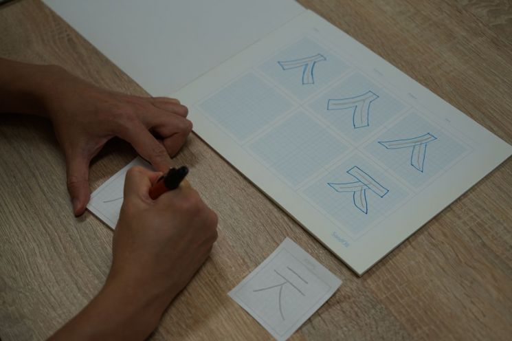 A reporter from this publication is participating in Sandol's font creation process, drawing consonants.
When mentioning the desire to embed keywords such as 'economy, digital, trust, readability, individuality' into the font, Shim asked to pick one of about ten pens and draw 'ㅅ' (siot) on graph paper. This is the first step in deciding the design concept.
'ㅅ' is a simple consonant that can be drawn with just two strokes, but the way people write it varies greatly. Some add decorative bends or sweeps at the stroke ends, while others write it in a single stroke. The size and shape also subtly change when combined with vowels or when used as an initial or final consonant. After about ten minutes of consideration and practice, Shim drew an 'honest siot' that places slightly more weight on readability than individuality.
Next, Shim suggested drawing a thick outline over the pencil-drawn consonant with another pen. He explained, "The font’s personality is best expressed through curves in the outlining process," and added, "The feeling changes when the font is enlarged, so this can be checked in advance."
Afterward, using the same method as for 'ㅅ,' he consecutively drew 'ㅈ' (jieut), 'ㅊ' (chieut), and 'ㅎ' (hieut). Starting from 'ㅅ,' which forms the style’s framework, each stroke is extended to reach 'ㅊ,' and then 'ㅎ' is completed by drawing a circle. Other consonants, vowels, and numbers are also styled in this way. During this process, drafts are frequently sent to the client to concretize their preferred font. All of this is part of communication.
Manually Creating Over 12,000 Korean Characters
Korean has 14 consonants and 10 vowels. One might think that creating just these 24 characters would complete font production, but this is a misunderstanding.
Shim said, "The font production period varies by language but takes from as short as four months to as long as a year," and added, "In the case of Korean, about 12,000 characters must be manually created." He continued, "Recently, derivative words like '뷁' or '쌞' are frequently used in books and social networking services (SNS), so all must be created one by one," emphasizing, "If these words are not well implemented, font corruption occurs, so meticulous work is required."
Fonts in the Digital Age... "A New Serif Era Will Come"
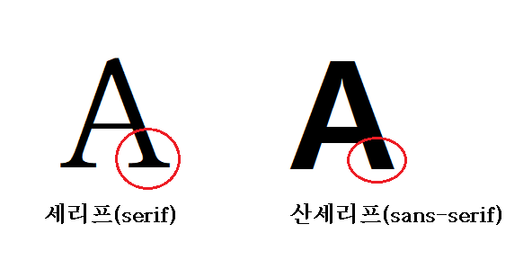
All fonts are broadly divided into two types: serif and sans serif. Serif fonts are decorated with strokes such as serifs or changes in thickness. Sans serif, from the French word 'sans' meaning 'without,' refers to fonts without decoration, featuring straight lines. In Korean, Myeongjo (Batang) corresponds to serif, and Gothic (Dotum) corresponds to sans serif. Serif fonts have been frequently used in traditional print media such as books and newspapers, while sans serif fonts have mainly been used in digital environments like PCs and mobile phones.
Shim confidently predicted that the serif font, whose influence has declined with the digital era, will regain attention. He said, "From ancient scriptures to modern times, almost all famous books used serif fonts," and added, "However, for the past 20 years, sans serif has replaced them because it is suitable for digital." He continued, "Recently, with the growth of IT technology and the font industry, there is a movement, mainly in regions using Roman letters, where elaborate typography is gaining attention even in digital environments," and expressed confidence, "Korean, with its simple and systematic strokes among East Asian scripts, can lead the upcoming new serif era."
☞ Sandoll
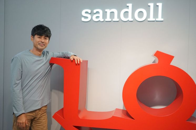
Founded in 1984, Sandoll is Korea’s number one font company, having developed over 720 fonts in 38 years. It has created representative Korean typefaces such as Microsoft’s default font ‘Malgun Gothic,’ Apple iPhone’s system font ‘Apple SD Gothic Neo,’ and Google’s ‘Noto Sans Korean.’ Last year, it achieved KRW 12 billion in consolidated sales and KRW 4.8 billion in operating profit. It is scheduled to be listed on the KOSDAQ market this October.
© The Asia Business Daily(www.asiae.co.kr). All rights reserved.


