Adding Gradient to Existing Logo
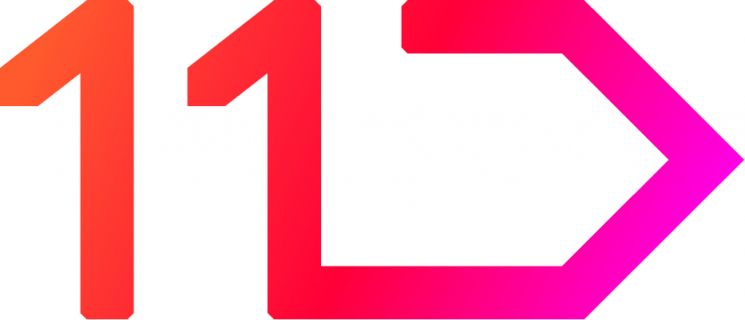
[Asia Economy Reporter Lim Chunhan] 11st announced on the 6th that it has unveiled a new logo (CI·BI) that adds a variety of colors to its existing brand logo.
The new logo of 11st adds a variety of colors through a gradient to the existing logo. Moving away from the single red color logo, it expresses the three core elements?customers (orange), shopping (red), and experience (pink)?each represented by its own color, connected seamlessly through a gradient. This symbolizes that the meeting of customers and shopping services provides more than double the satisfying experience.
The gradient color changes will be reflected in all components, from the 11st application (app) icon to banners within the 11st service and purchase buttons. Existing designs within the service will be offered in a more simplified form. The plan is to provide a unique 11st customer experience that is intuitive yet vibrant in every detail through the harmony of simple design and the logo’s diverse colors.
Ha Hyung-il, CEO of 11st, said, “This year, we are focusing all strategies and investments on sustainable growth with a completely different version from before,” and added, “The new logo will be a commitment and a goal to ensure that customers enjoy diverse shopping pleasures and satisfying experiences.”
© The Asia Business Daily(www.asiae.co.kr). All rights reserved.
!["The Woman Who Threw Herself into the Water Clutching a Stolen Dior Bag"...A Grotesque Success Story That Shakes the Korean Psyche [Slate]](https://cwcontent.asiae.co.kr/asiaresize/183/2026021902243444107_1771435474.jpg)


