Introduction of Universal Design 'CUD' Accessible to All People Regardless of Gender, Age, Disability, or Language
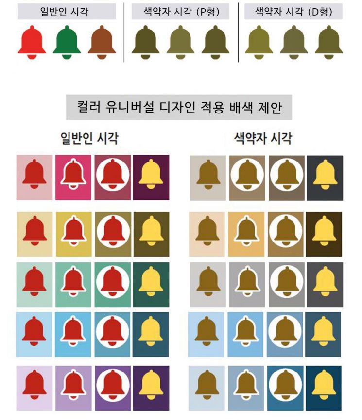 'Color Universal Design Applied Safety Sign Color Guide for Underground Parking Lots in Apartment Complexes' Developed by KCC.
 [Photo by KCC]
[Asia Economy Reporter Kim Jong-hwa] KCC is taking the lead in creating safer urban spaces by establishing a color scheme guide for safety signs that incorporates Color Universal Design (CUD).
Recently, KCC developed the "Color Scheme Guideline for Safety Signs in Underground Parking Lots of Apartment Complexes Applying Color Universal Design." This color design guideline considers color schemes so that colorblind individuals, who have difficulty perceiving certain colors, can intuitively identify warning signs.
Universal design refers to a design that is inclusive of diverse users. It is designed so that everyone can use it without difficulty regardless of gender, age, disability, or language. KCC focused on colorblind individuals who suffer disadvantages in a society designed primarily for people with normal vision. Unlike the general population, those with protanopia (P-type) or deuteranopia (D-type) may perceive various colors as the same color, making it difficult to convey information if the color scheme with the background is not considered.
To identify color scheme types that are difficult to distinguish from the perspective of colorblind individuals, KCC conducted on-site investigations. They analyzed color manuals used for safety signs in underground parking lots at recently completed apartment complexes by leading domestic construction companies in Seoul and the metropolitan area within the last three years and surveyed the actual colors used on site.
The investigation results condensed the used color schemes into three main types: △ high-saturation red + light achromatic color △ white + chromatic color △ high-saturation red + chromatic color. Among these, the "high-saturation red + chromatic color" combination, which has a low brightness difference between colors, was found to be a color scheme type difficult for colorblind individuals to identify, accounting for about 61% of all color schemes.
Accordingly, KCC proposed a design that enhances visibility by adding an achromatic (white) background or a border between the main sign and the background color. Another alternative suggested was changing the sign color to a yellow tone to significantly increase the brightness contrast with the background color, making it more noticeable.
KCC compiled these research results into a paper and presented it at the 2021 Spring Academic Conference hosted by the Korean Society of Color Studies, where it received the Excellent Paper Presentation Award. This achievement was made by the KCC Color & Design Center, which provides customer-tailored design insights and solutions through big data analysis.
Going forward, KCC plans to gradually increase the application of this guideline-based design in new apartment painting or repainting for renovations to build a safer living environment and to promote a universal design culture that considers socially vulnerable groups.
A KCC official stated, "The ultimate goal of Color Universal Design is to build an urban environment where everyone can identify and use colors without problems and where color information can be conveyed more accurately." He added, "Although this color scheme guideline started focusing on safety signs in underground parking lots, it holds great significance in creating social value that considers and embraces socially vulnerable groups."
© The Asia Business Daily(www.asiae.co.kr). All rights reserved.


