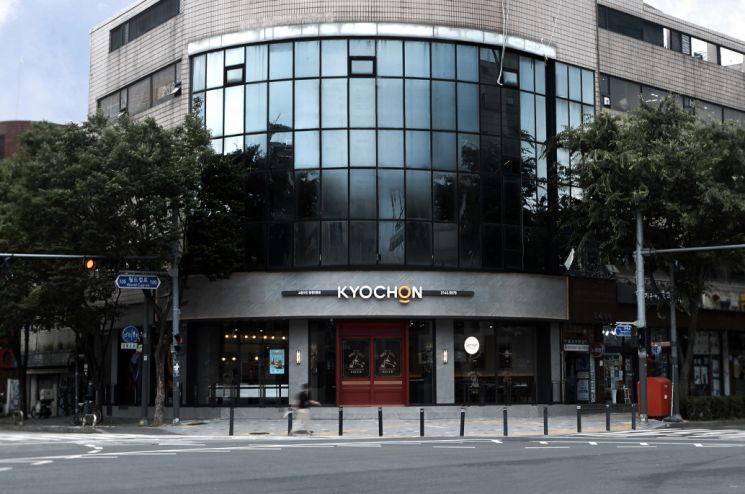
[Asia Economy Reporter Choi Saeng-hye] Kyochon F&B announced on the 14th that it has unveiled a new BI (Brand Identity) and SI (Store Identity) for Kyochon Chicken.
Through this renewal, Kyochon plans to strengthen its differentiated brand image and approach the younger MZ generation more closely.
The new BI emphasizes the transformation into a food lifestyle brand for the MZ generation (Millennials + Generation Z), expressing youthful sensibility and taste. It uses orange color as a point to reflect lively enjoyment, and visually represents the brand philosophy of putting full effort in the word ‘ON’. Below the ‘O’ is a round point symbolizing a bowl that holds sincerity. Additionally, compared to the previous BI, the font is simpler and clearer to enhance readability.
The store design is based on the concept of ‘a place that creates delicious joy.’ The exterior (fa?ade) uses burgundy color as the signature color, combined with the newly changed logo to convey a lively and joyful atmosphere. The elegant wood ceiling panels visible upon entering and the lighting above the counter, which customers encounter first, create a more luxurious and warm ambiance. Store styles will be differentiated not simply by area size but by role and scale within the commercial district, aiming to strengthen the characteristics of each regional location.
Stores applying the new BI and SI, such as the Seoul Mangwon 2-dong branch and Pyeongtaek Godeok 1st branch, opened last month, with plans for sequential expansion thereafter.
A Kyochon representative said, “This brand design change was carried out not only to maintain our position as the number one chicken franchise in Korea but also to enhance brand value and differentiation for growth as a global food company. Based on the new design, we aim to shift consumer perception from the existing differentiated premium image to a younger and trendier brand image.”
© The Asia Business Daily(www.asiae.co.kr). All rights reserved.


