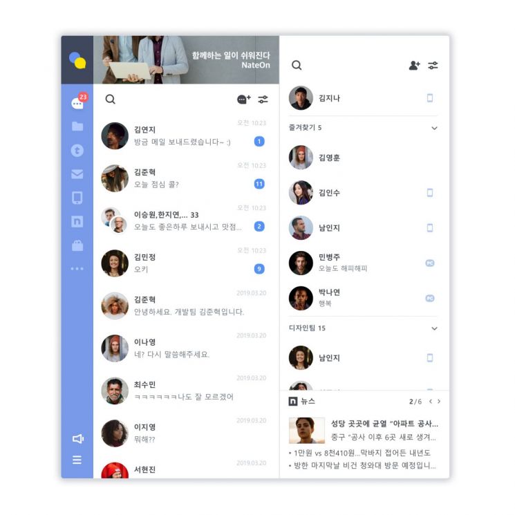
[Asia Economy Reporter Buaeri] Messenger NateOn is revamping its overall design, including the logo, to transform into a business messenger.
SK Communications announced on the 16th that it will improve NateOn's brand identity (BI), design, and services.
NateOn has changed from uppercase 'NATE ON' to lowercase 'nate on.' The logo is expressed in a combination of blue and yellow.
SK Comms explained, "The new BI embodies NateOn's determination to leap forward as a business messenger," adding, "We aimed to communicate with users through a friendly and trendy image."
Both the PC and mobile versions of NateOn will undergo a complete design overhaul. Functions have been rearranged simply to allow users to use the service conveniently. New emoticons will also be added.
Newly added features include the 'Shopping Tab,' where users can view domestic agricultural, livestock, and fishery products along with shopping information, and the 'Nate Tab,' which allows quick portal access for easy news enjoyment.
The revamped NateOn will be available at the end of July.
Kim Kyung-ok, NateOn manager at SK Comms, said, "This revamp is a new starting point to optimize NateOn as a business messenger," and added, "We will continue updates to resolve user inconveniences and improve work productivity."
© The Asia Business Daily(www.asiae.co.kr). All rights reserved.
![Clutching a Stolen Dior Bag, Saying "I Hate Being Poor but Real"... The Grotesque Con of a "Human Knockoff" [Slate]](https://cwcontent.asiae.co.kr/asiaresize/183/2026021902243444107_1771435474.jpg)


